You may have noticed your local ALDI has changed recently. If not, it’s about to.
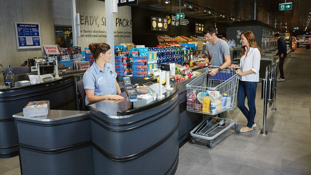
Our first major store transformation in 17 years is currently making its way across the eastern seaboard. Based on store trials and a format that was rolled out to SA and WA, it’s a fresh new look that completely transforms the ALDI shopping experience.
The transformation is a reflection of the shifting expectations of Aussie shoppers, who are now more focused on the in store experience and finding a supermarket that caters to changing food preferences.
How supermarkets have evolved
Some of the biggest supermarket changes over the last few decades have been within the areas of fresh produce, meat, poultry, seafood and dairy. From the rise in organic and free-range options to wider selections of fresh local fruit and vegetables, the perimeters of supermarkets have evolved to cater to our desire for healthier food choices. In fact, for many Aussies the quality of a supermarket’s fresh produce and protein are now deciding factors in determining where they choose to shop.
These factors came into consideration for Ben Lawlor and his team when they began working on ALDI’s new store format. Ben is a Project Director for internal store design and development at ALDI. Since 2014, Ben has been faced with the huge task of ensuring the new layout is rolled out across all east coast stores over the next six years.
“When we began planning our store concepts, we had to think not just about what our customers wanted from us then, but what they would want from us in 2020,” Ben explains.
We asked Ben to talk us through the changes and how they benefit ALDI shoppers.
Starting with the customer
The rise of online shopping alternatives means that when customers make the decision to visit a supermarket, they do so for the experience and want their grocery shopping to be as enjoyable as possible.
“Just because you want to save money it doesn’t mean you shouldn’t expect a great shopping experience,” Ben explains.
Gone are the yellow tiles, peacock blue walls and brown panelling. Instead think soft lighting, neutral tones, quirky captions and more space to navigate the aisles.
“So many customers ask us how we have been able to make our stores bigger,” Ben says. “We haven’t increased the floor space at all, we have just been smarter about the layout.”
The increase in space has been made possible by shallower shelving that can be easily re-arranged and upright freezers that allow you to see products more easily. The fruit and veg section is one of the major changes. Previously much of ALDI’s produce was stocked in Special Buys bays but these have been replaced with upmarket produce shelving.
Focus on fresh
Aussies love fresh food and are increasingly interested in the seasonality and quality of fresh ingredients. One of the biggest reasons for the redesign was to create more space for fresh produce, meat, seafood and dairy as well as other healthy food options.
Changes to product merchandising throughout the store have made it easier for customers to find what they want and need.
“Feedback from customers has been that they think we have introduced many new products,” explains Ben. “The fact is, we’ve just made them easier to find.”
Ben explains that in reorganising the store, ALDI sat down with a number of suppliers to better understand how products complemented one another, in an effort to make the shopping experience more convenient. Now you’ll also find dried fruit and nuts near cereal, baking goods in one spot (instead of several) and meat and produce at the front of all refurbished stores.
“We know that customers often plan their meals around protein, so we felt it made sense to position meat and produce next to each other at the front of the store, followed by other complementary ingredients like sauces, pastas and grains, once those hero items had been chosen.”
High quality at the lowest possible price
Ben and his team have left no tile or shelf unturned in the redesign of the store format. Working with a local architect and Australian design company, Landini Associates, every aspect of the project considered costs and timelines.
For example, in the early stages of the redesign, the plan was to retain the iconic yellow ceramic tiles found in all ALDI supermarkets around the world. But as the design process progressed, the decision was made that the tiles needed to be replaced.
“We found out it would take us 45 days to rip out and replace 1000sqm of ceramic tiles with new ones,” says Ben. “We just can’t close a store for that amount of time. So we explored other options and have chosen a low cost, linoleum flooring, which we actually laid straight on top of the existing tiles.”
And as for the new vertical freezers, where products are displayed in your line of sight, these were designed with an Austrian company specifically for ALDI Australia and are now being rolled out to other retailers around the world.
Looking to the future
So what does the future of supermarkets look like? Well, it’s fair to say Aussie supermarkets are still a long way from shelves re-stocked by robots, automated trolleys and augmented reality screens filled with product information. However, we definitely expect the supermarket scene to produce lots of unexpected innovations for the next phase of retail history.
What’s next for your ALDI? From start to finish, the ALDI refurbishment will have taken six years to implement from vision to reality. The new store layout has been designed with the future in mind, but shoppers can expect to see continued innovation, with more digital elements integrated into the shopping experience. While we are committed to innovation, there are a few things that Australians have come to know and love about ALDI that won’t change. Our customers will still be able to browse Special Buys in the middle of store, circulate our wide aisles with ease and have their shopping scanned at efficient speeds for years to come!


